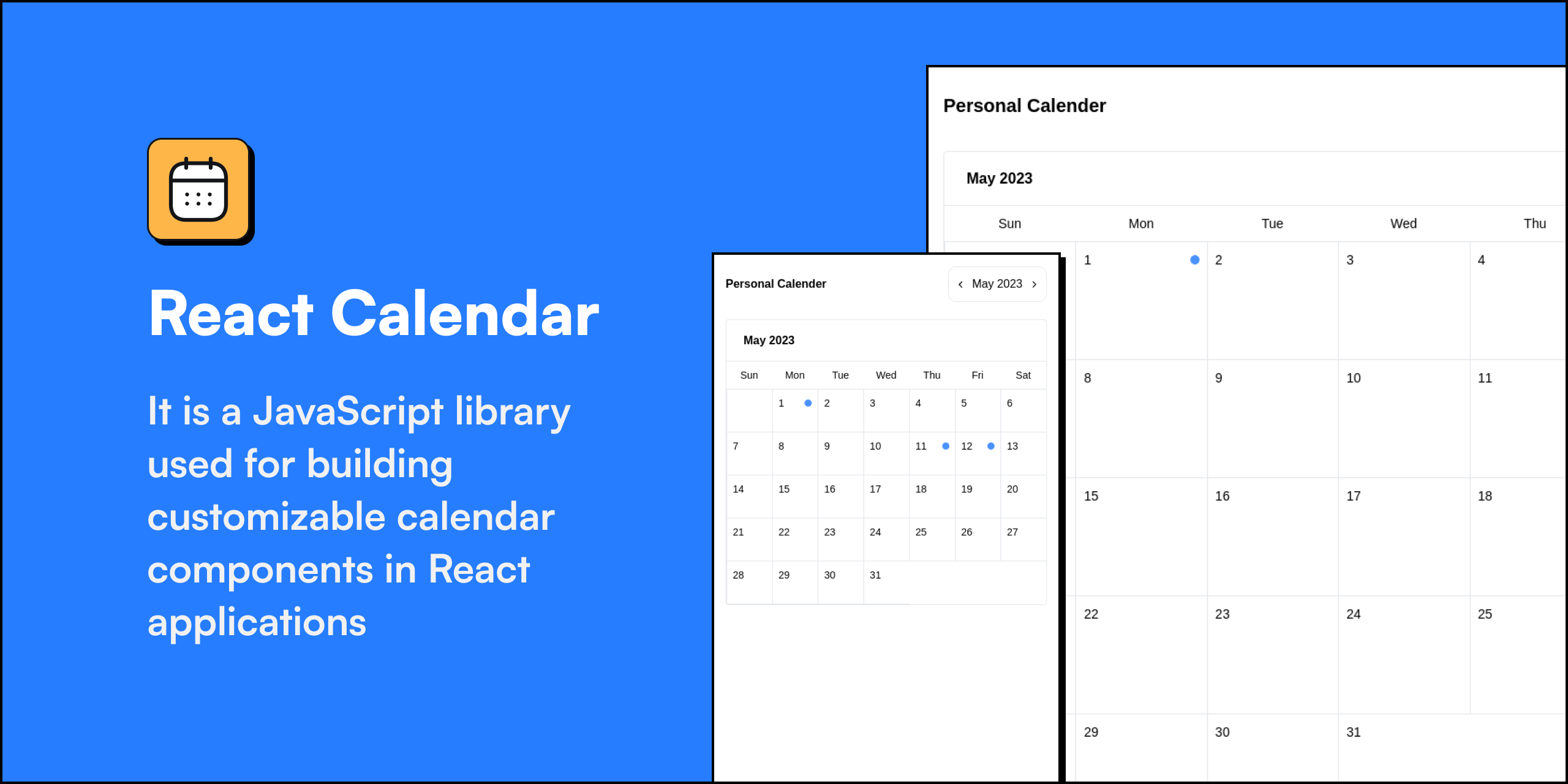


A lightweight, dark-mode-aware React calendar component with month and week views, color-coded events, and an event detail popup.
Requirements: React 18 or 19 (peer dependency) and
dayjs.
-
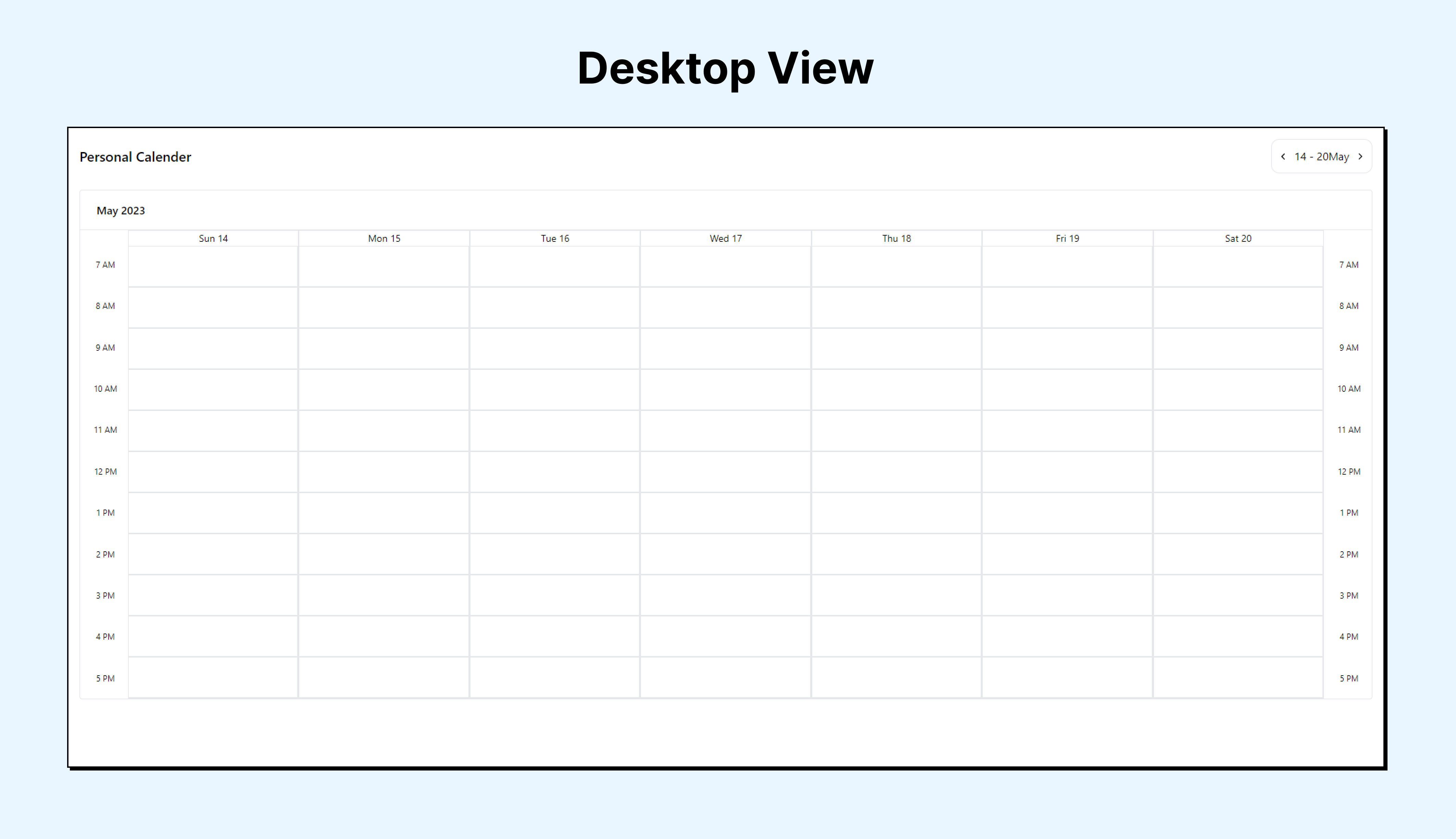
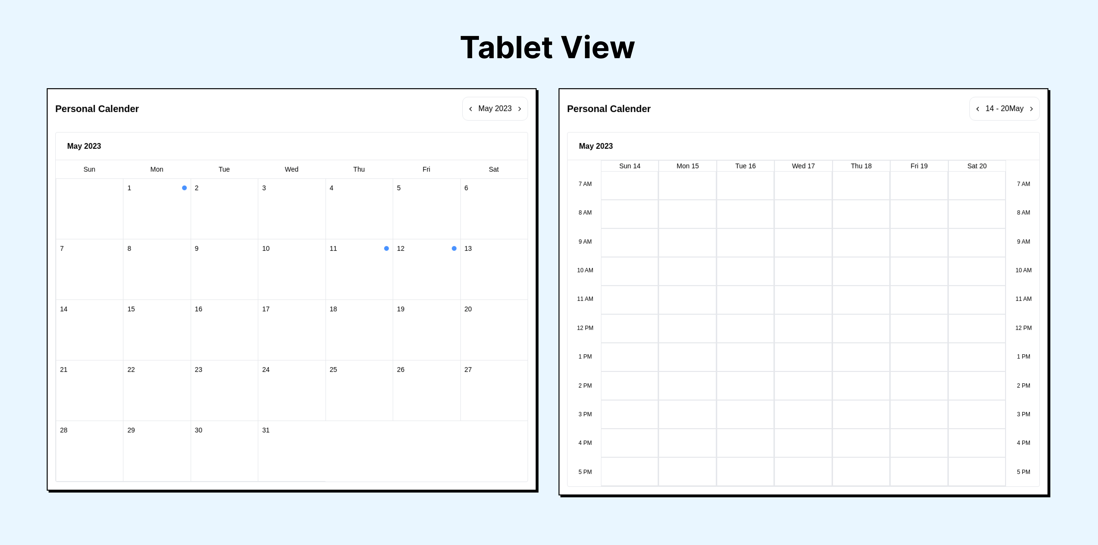
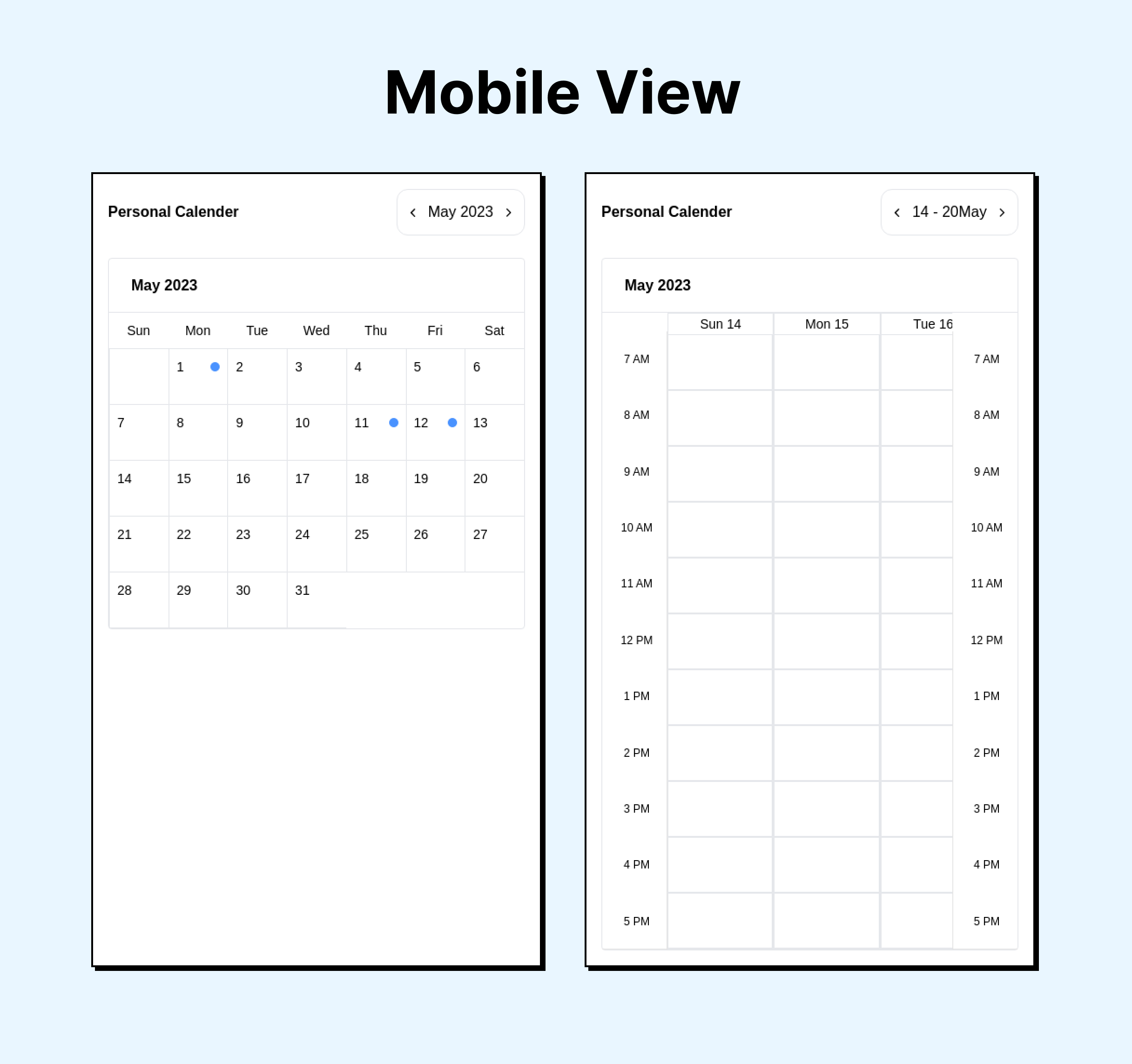
Week View: Display the calendar in a weekly format, showing individual days of the week horizontally. Each day have separate columns or sections to represent different time slots.
-
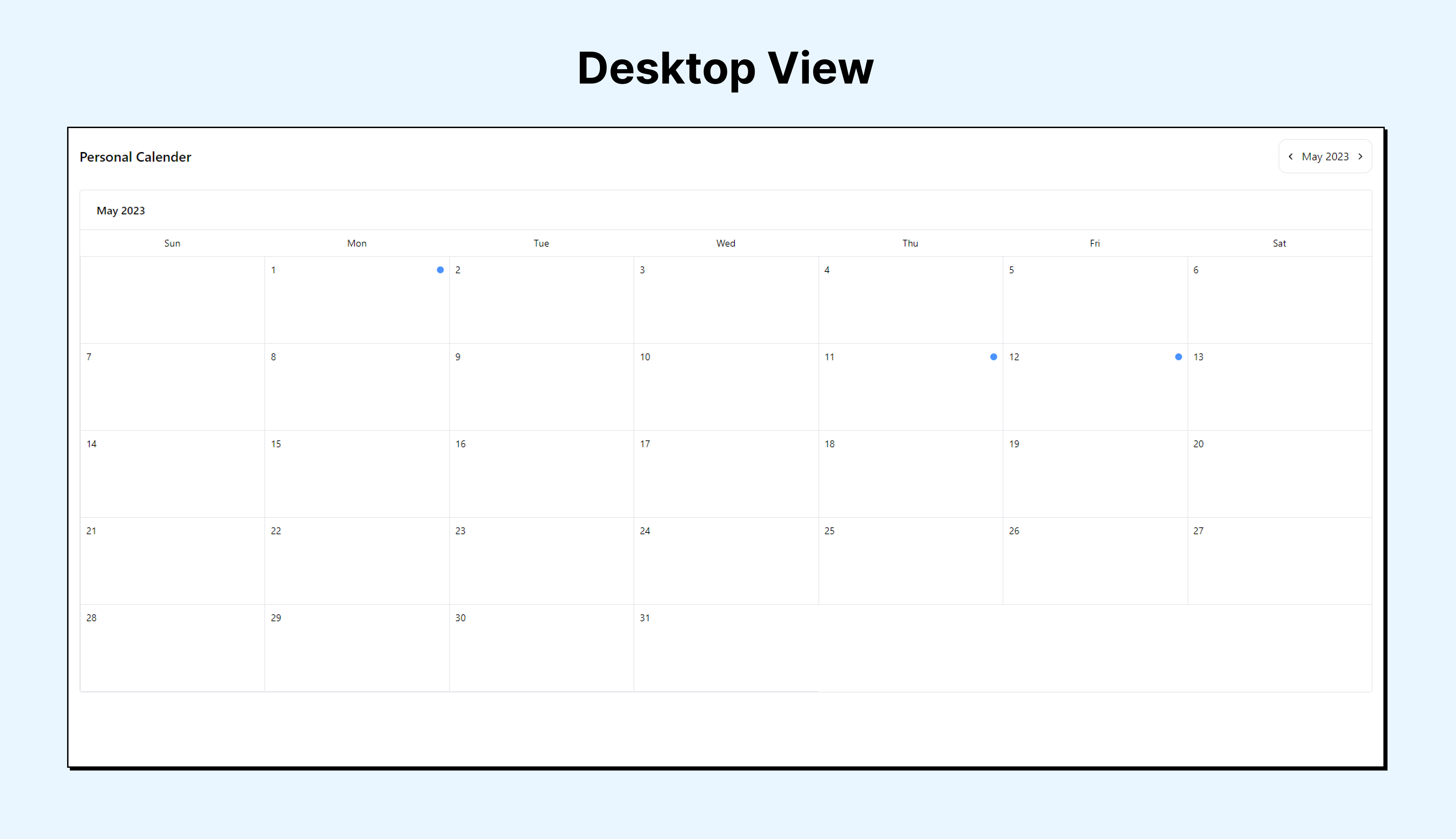
Month View: Display the calendar in a monthly format, showing all days of the month in a grid layout. Each day should provide a summary of the events scheduled for that day.
-
Event Display: Show events as blocks or markers within the calendar grid. In both week and month views, events should be visually distinguishable and displayed in their respective time slots.
-
Event Details Modal: When a user clicks on an event in the calendar, open a modal window displaying detailed information about the event. This should include the event title, description, start and end time, and any other relevant information.
npm install solguruz-calendarThen import the pre-built stylesheet once at your app's entry point:
import 'solguruz-calendar/styles';Tailwind users — if your project already uses Tailwind, add the package to your
contentpaths instead of importing the stylesheet:// tailwind.config.js content: [ // ...your existing paths './node_modules/solguruz-calendar/dist/**/*.{js,mjs}', ];
import { Calendar } from 'solguruz-calendar';
import 'solguruz-calendar/styles';

const events = [
  {
    date: '16/06/2026', // DD/MM/YYYY
    task: [
      { startTime: '09:00 AM', endTime: '10:00 AM', title: 'Team Standup' },
      { startTime: '02:00 PM', endTime: '03:00 PM', title: 'Design Review' },
    ],
  },
];

export default function App() {
  return <Calendar name="My Calendar" type="month" events={events} />;
}| Prop | Type | Required | Description |
|---|---|---|---|
name |
string |
Yes | Calendar title shown in the header |
type |
"month" | "week" | "all" |
Yes | View mode. "all" shows a Month/Week toggle |
events |
Data[] |
No | Array of event objects (see types below). Defaults to [] |
disabledDates |
string[] |
No | Dates to disable in DD/MM/YYYY format. Disabled cells are non-clickable and grayed out |
enableThemeToggle |
boolean |
No | Opt-in dark/light mode. When true, shows the sun/moon toggle and remembers the choice. When omitted/false, stays light. Defaults to false |
import type { Data, WeekData } from 'solguruz-calendar';

interface Data {
  date: string; // DD/MM/YYYY
  task: {
    startTime: string; // e.g. "09:00 AM"
    endTime: string; // e.g. "10:00 AM"
    title: string;
  }[];
}

interface WeekData {
  startTime: string;
  endTime: string;
  title: string;
}Month view
<Calendar name="Team Calendar" type="month" events={events} />Week view
<Calendar name="Team Calendar" type="week" events={events} />Both views with a toggle
<Calendar name="Team Calendar" type="all" events={events} />With disabled dates
<Calendar
  name="Team Calendar"
  type="month"
  events={events}
  disabledDates={['21/06/2026', '22/06/2026']}
  enableThemeToggle={false}
/>The calendar includes a built-in moon/sun toggle button in the header. No extra configuration is needed — it:
- Reads
localStoragefor a saved preference on mount - Falls back to the OS
prefers-color-schemesetting if no preference is saved - Persists the choice to
localStorageon every toggle
Library: React, TypeScript, Tailwind CSS (pre-compiled), dayjs Demo app: Next.js
Clone and install:
git clone https://github.com/solguruz/react-calendar.git
cd react-calendar
npm install
Run the Next.js demo app:
npm run devBuild the distributable library:
npm run build:libCreate and inspect the npm tarball:
npm run pack:libOption 1 — npm link (recommended during development)
# in this repo
npm link

# in your consumer project
npm link solguruz-calendar
After any change, re-run npm run build:lib — the consumer project picks up the update automatically.
Option 2 — install the tarball
# in this repo
npm run pack:lib

# in your consumer project
npm install /path/to/solguruz-calendar-0.1.0.tgz| Command | Description |
|---|---|
npm run dev |
Start the Next.js demo app |
npm run build |
Build the Next.js demo app |
npm run lint |
Run ESLint |
npm run build:lib |
Bundle the library (JS + CSS) into dist/ |
npm run pack:lib |
Build then create an npm tarball for local testing |
Engineering Quality Solutions by employing technologies with Passion and Love | Web and Mobile App Development Company in India and Canada


Contributions are always welcome! Open an issue or pull request on the GitHub repository.
MIT License

Copyright (c) 2026 SolGuruz Pvt. Ltd.

Permission is hereby granted, free of charge, to any person obtaining a copy
of this software and associated documentation files (the "Software"), to deal
in the Software without restriction, including without limitation the rights
to use, copy, modify, merge, publish, distribute, sublicense, and/or sell
copies of the Software, and to permit persons to whom the Software is
furnished to do so, subject to the following conditions:

The above copyright notice and this permission notice shall be included in all
copies or substantial portions of the Software.

THE SOFTWARE IS PROVIDED "AS IS", WITHOUT WARRANTY OF ANY KIND, EXPRESS OR
IMPLIED, INCLUDING BUT NOT LIMITED TO THE WARRANTIES OF MERCHANTABILITY,
FITNESS FOR A PARTICULAR PURPOSE AND NONINFRINGEMENT. IN NO EVENT SHALL THE
AUTHORS OR COPYRIGHT HOLDERS BE LIABLE FOR ANY CLAIM, DAMAGES OR OTHER
LIABILITY, WHETHER IN AN ACTION OF CONTRACT, TORT OR OTHERWISE, ARISING FROM,
OUT OF OR IN CONNECTION WITH THE SOFTWARE OR THE USE OR OTHER DEALINGS IN THE
SOFTWARE.