

Keep an eye on what's happening on your machine and in the world.
Gailan (概览 - Gàilǎn) is the Mandarin Chinese translation of the German Übersicht ("Overview").
Read it in Cantonese instead and you get 芥蘭 🥦, Chinese broccoli. That wasn't the plan, but it's a fine vegetable and I'm not fighting it.
Gailan is a fork of felixhageloh/uebersicht. For general info on the original project, check out the Übersicht website.
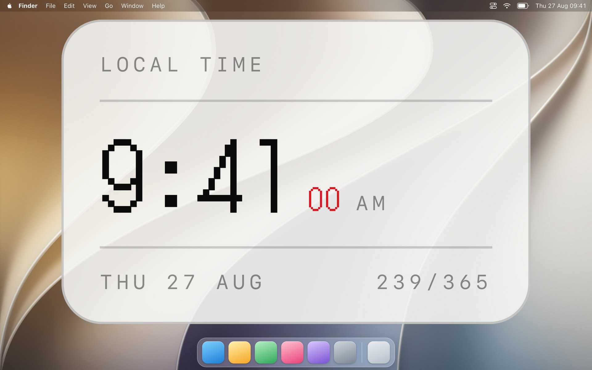
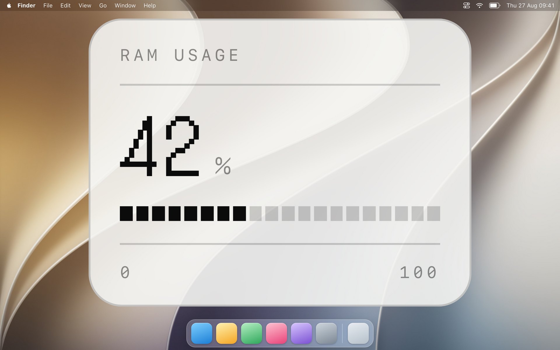
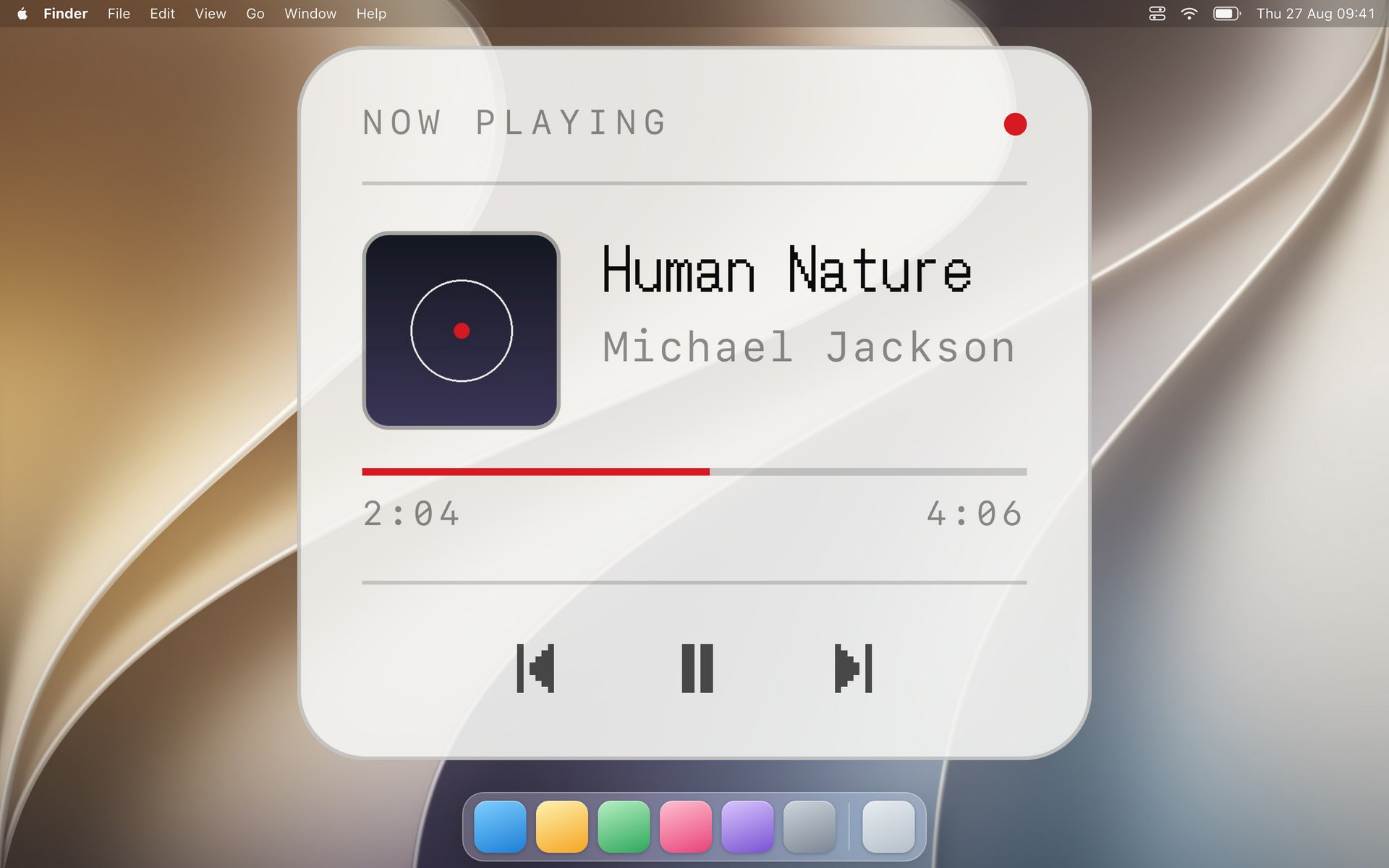
Three to start with, from GailanHub. Each is a folder of files you can read, and each downloads as a zip from the gallery.
|
|
|
| Clock The time on a dot matrix, or hands on a dial. |
System Monitor Memory, processor, disk or network, on a scale you can read a value off. |
Now Playing The track, its cover, and controls that work. Needs Spotify or the Music app. |
Gailan is not backwards compatible with Übersicht, and it is not an in-place upgrade. The app is a separate application with its own name, bundle id and support directory, so it installs beside Übersicht instead of replacing it, and Übersicht's own updater will never offer it. Widget code carries over, since the widget API is the same; settings and the widgets folder do not, and have to be moved by hand. The bundled Node also jumped from 16 to 24, so a widget whose command depends on old Node behavior, or that bundles a native module built for Node 16, needs rebuilding. Upstream breaking changes: Node 18, 20, 22, 24 · React 19 · CoffeeScript 2 · Emotion 11 · ws 8
The specifics:
- bundle id is
com.kevster.Gailan(AppleScript needs the new id) - widgets live in
~/Library/Application Support/Gailan/widgets - the widget API module is imported as
gailan;uebersichtstill resolves, so existing widgets keep working - the container element is
#gailan, so user CSS targeting#uebersichtneeds updating - widget commands run through zsh by default; Preferences has a dropdown to use fish instead. Übersicht used bash, so plain POSIX commands work the same in zsh, though bash-specific syntax may need adjusting
- Preferences also has an appearance override: System, Light or Dark, which widgets
see through
prefers-color-scheme - if Übersicht is running when Gailan starts, a dialog offers to quit one of them (Gailan is an upgraded Übersicht, so running both doubles every widget)
- widgets are bundled with esbuild rather than browserify.
.jsx,.tsxand classic object-literal widgets all still work; what changed is that a widget bundle publishes itself intoglobalThis.__gailanWidgetsinstead of registering with browserify's require - a widget can ask macOS to glass the desktop behind it; see Glass over the desktop
- Widgets… in the menu opens a window showing every installed widget as a card, with a switch, its screens, and the settings the widget declares. See Widget settings
- a widget can declare its own settings, which the app turns into controls and saves beside the widget
- widget ids no longer carry the file extension:
Clock.jsxisClock, notClock-jsx, and a widget in its own folder takes the folder's name. Anything referring to a widget by id, AppleScript included, needs updating - Opens at login the first time it runs, since a desktop of widgets that has to be started by hand is a desktop of widgets nobody sees. The switch is in Preferences, and turning it off is remembered
- Open Widgets Hub in the menu opens the widget gallery, where each widget in GailanHub downloads as a zip. Übersicht widgets still work, so that gallery is worth a look too
- Check for Widget Updates compares the version in each widget's
widget.jsonagainst the version GailanHub holds and lists what is behind, one checkbox per widget, so you install the ones you want. The same check runs once a day and opens nothing when there is nothing to install. Your saved settings survive an update, since only the files the hub ships are replaced - requires macOS 13.5 or later, which the bundled Node runtime and the system APIs it uses both need. The app will not launch on anything older
The Node runtime is Node 24, the current LTS, and is no longer checked into git; see Building Gailan.
Against Übersicht 1.6.82, the most recent release at the time of the fork:
| Übersicht | Gailan | |
|---|---|---|
| bundled Node | 16.1.0 | 24.20.0 |
| minimum macOS | 10.11 (Podfile), 12.0 (target) | 13.5 |
| React | 16.13 | 19.2 |
| CoffeeScript | coffee-script 1.12, for widgets and the server |
removed; the server is TypeScript |
| Emotion | 10 (emotion, @emotion/core) |
11 (@emotion/css, @emotion/react) |
| widget bundler | browserify 16.5 | esbuild 0.25 |
| browserify | 16.5 | 17.0, client and server bundles only |
| ws | 6.0 | 8.21 |
| redux | 3.7 | 5.0 |
| superagent | 3.8 | 10.3 |
| esprima / escodegen | 2.7 / 1.14 | 4.0 / 2.1 |
| minifier | uglify-js 3.10 | terser 5.51 |
| stylus | 0.54 | 0.64 |
| tape | 4.13 | 5.10 |
| through2 | 2.0 | replaced by node streams |
| jQuery | 3.5 | 3.7, deliberately not 4.x |
| Sparkle API | SUUpdater (Sparkle 1, deprecated) |
SPUStandardUpdaterController |
jQuery stays on 3.x because 4.0 removes APIs that classic widgets use. Everything else is the current release of its line.
Copy your widgets across and they will run. Gailan reads the same widget API, so the files themselves need no changes in the common case.
cp -R ~/Library/Application\ Support/Übersicht/widgets/* \
      ~/Library/Application\ Support/Gailan/widgets/
Übersicht's directory name contains a ü, which macOS may store either precomposed or
decomposed, so if the shell cannot find the path use tab completion or copy the folder in
Finder instead.
Settings do not carry over. Per-widget choices (which screen a widget shows on, whether it is hidden, whether it sits in the background) live in the app's own preferences and have to be set again from the status bar menu. The widgets folder location, the shell, and the login item are in Gailan Preferences.
Both apps can run at once, but they will each render every widget, so quit Übersicht first. Gailan offers to do that for you when it starts.
import {...} from "uebersicht"keeps working. Gailan exposes the same module under both names, so there is nothing to rewrite, though"gailan"is the name going forward.- CSS targeting
#uebersichtdoes not. The container element is#gailan. This is the one change most likely to be needed, and it applies tomain.cssin the widgets folder as well as to widget styles. - AppleScript referring to
application id "tracesOf.Uebersicht"needs"com.kevster.Gailan". - bash-specific command syntax may need adjusting, or set the shell back in Preferences. Widget commands run through zsh by default, where Übersicht used bash. Plain POSIX commands behave the same in both.
- native modules bundled inside a widget need rebuilding against Node 24.
- Widget commands that depend on old Node behavior need looking at, per the breaking changes linked above.
Nothing else about a widget changes: command, refreshFrequency, render,
updateState, className, the classic object-literal widgets, window.$, and the
/run/ proxy all behave as they did.
In essence, widgets are TypeScript (or JavaScript) modules that expose a few key properties and methods. They need to be defined in a single file with a .tsx (or .jsx) extension for Gailan to pick them up. Types are stripped when the widget is bundled, not checked. CoffeeScript widgets are not supported: Übersicht's classic API still works, but the file has to be .js. Check the old documentation for that API. Gailan listens for file changes inside your widget directory, so you can edit widgets and see the result live.
Widget rendering is done using React and its JSX syntax. Simple widget state is managed for you by Gailan, but for more advanced widgets you can manage state using a Redux-like pattern. You dispatch events, which are processed by a single updateState function that returns the new state, which is then passed to your widget's render function.
State is kept when you modify your widget, which allows for live coding. Any changes to the UI of your widget will be immediately visible. One drawback (at least with the current implementation) is that if you change the shape of your state you might have to 'Refresh all Widgets' from the app menu for your widget to work.
You can also include node modules and split your widget into separate files using ESM syntax. Any file that is in a directory called /node_modules, /lib or /src will be treated as a module and will not show up as a separate widget.
The following properties and methods are supported:
A string containing the shell command to be executed, or
a function(dispatch : function) which eventually dispatches an event,
or undefined, meaning that no command will be executed for this widget.
For example:
export const command = "echo Hello World";Watch out for quotes inside commands. Often they need to be properly escaped, like:
export const command = "ps axo \"rss,pid,ucomm\" | sort -nr | head -n3";Example using a command function:
export const command = (dispatch) =>
  fetch('some/url.json')
    .then((response) => {
      dispatch({ type: 'FETCH_SUCCEEDED', data: response.json() });
    })
    .catch((error) => {
      dispatch({ type: 'FETCH_FAILED', error: error });
    });
The first and only argument passed to a command function is a dispatch function, which you can use to dispatch plain JavaScript objects, called events, to be picked up by your updateState function.
A number specifying how often the above command is executed.
It defines the delay in milliseconds between consecutive command executions. Example:
export const refreshFrequency = 1000; // widget will run command once a secondThe default is 1000 (1s). If set to false the widget won't refresh automatically.
An object or string defining the CSS rules to be applied to the root of your widget.
It is most commonly used to control the position of your widget. It is converted to a CSS class name using the Emotion CSS-in-JS library. Read more about styling your widgets.
export const className = {
  top: 0,
  left: 0,
  color: '#fff'
}
or
export const className = `
  top: 0;
  left: 0;
  color: #fff;
`
Note that widgets are positioned absolutely in relation to the screen (minus the menu bar), so a widget with top: 0 and left: 0 will be positioned in the top left corner of the screen, just below the menu bar.
A function(props : object) to render your widget.
If you know React functional components, you know how render works. The props passed to this function is whatever state your updateState function returns. If you don't provide your own updateState function, the default props that are passed are output and error, containing the output your command produced and any error that might have occurred.
export const render = ({output, error}) => {
  return error ? (
    <div>Something went wrong: <strong>{String(error)}</strong></div>
  ) : (
    <div>
      <h1>We got some output!</h1>
      <p>{output}</p>
    </div>
  );
}
The default implementation of render just returns output.
A widget can declare settings of its own in a widget.json beside it. Gailan turns
each into a control in the Widgets window, saves what you choose, and hands the
values to render as props.settings.
{
  "title": "Clock",
  "settings": [
    {
      "key": "size",
      "type": "choice",
      "label": "Size",
      "default": "medium",
      "options": [
        {"value": "small", "label": "Small"},
        {"value": "medium", "label": "Medium"},
        {"value": "large", "label": "Large"}
      ]
    },
    {
      "key": "accent",
      "type": "list",
      "label": "Accent",
      "default": "red",
      "options": [
        {"value": "red", "label": "Red"},
        {"value": "amber", "label": "Amber"},
        {"value": "green", "label": "Green"}
      ]
    },
    {"key": "showSeconds", "type": "toggle", "label": "Show seconds", "default": true},
    {"key": "opacity", "type": "number", "label": "Opacity", "default": 42, "min": 10, "max": 90}
  ]
}
export const render = ({output, settings = {}}) => (
<div style={{opacity: (settings.opacity ?? 42) / 100}}>
{settings.size === "large" ? <big>{output}</big> : output}
</div>
)Each type becomes one control:
| type | control | extras |
|---|---|---|
choice |
segmented picker | options, as strings or {value, label} |
list |
menu | options, the same as choice |
toggle |
switch | |
number |
slider with its value | min, max, step |
text |
text field | |
color |
color well with opacity | stored as #rrggbbaa |
choice and list hold the same thing and differ only in the control. Segments read
well for two or three short options and badly for more, where a menu is what somebody
expects.
Every setting needs a key and a type. label, help and default are
optional, though a default is worth setting: it is what the control shows before
anything has been chosen.
A setting can also say when it applies. enabledWhen names other settings and the
values that make this one usable; the control stays visible and greys out otherwise.
{
  "key": "hours",
  "type": "choice",
  "label": "Hours",
  "default": "12",
  "options": ["12", "24"],
  "enabledWhen": {"face": "digital"}
}
The clock uses exactly that: 12 or 24 hours says nothing about a dial, so it greys
while the face is analog. A key can accept several values ({"face": ["digital", "dots"]}), and all the keys named have to be satisfied at once. Values are compared
as text, so true and 82 match without being quoted. A condition naming a setting
the widget never declares is ignored, so a typo leaves the control usable rather than
stuck.
title is separate from the settings and is the name the Widgets window shows,
falling back to the widget id.
A widget can say what it needs on the machine. Gailan checks each entry when the widget loads and, where something is missing, blurs the widget and writes across it which dependencies are not installed. The widget's command still runs, so a widget that can do something useful without one of them still does it.
{
  "title": "Media Stats",
  "dependencies": [
    {"type": "command", "name": "ffmpeg", "hint": "brew install ffmpeg"},
    {"type": "python", "name": "requests", "hint": "pip3 install requests"},
    {"type": "node", "name": "chalk"},
    {"type": "brew", "name": "imagemagick"},
    {"type": "shell", "name": "docker running", "test": "docker info"}
  ]
}| type | what it checks |
|---|---|
command |
on PATH, by command -v |
node |
resolvable, from the widget's own node_modules or wherever else node looks |
python |
importable by python3 |
ruby |
requirable by ruby |
brew |
installed under brew's prefix |
shell |
whatever test says; a zero exit means present |
name is what gets named in the message, hint is optional, and test applies to
shell only. An entry without a usable type and a name is ignored.
Where the interpreter itself is absent, the message names the interpreter rather than
the package: a widget asking for a python module on a Mac with no python3 reads
python3 in the list.
Answers are cached for as long as the app runs and shared between widgets, so ten
widgets naming ffmpeg cost one check. Refreshing a widget checks again, which is
what to do after installing something.
What you choose is written to settings.json in the widget's own folder, so the
settings travel with the widget: copy the folder to another Mac and it looks the
same. That file is not a widget, so saving one does not trigger a rebuild. Edit it
by hand if you prefer; it is read when the widget loads.
Beside it, settings.default.json holds what each setting falls back to. Gailan
writes it the first time it sees the widget, taking the default from each entry in
the manifest, and then leaves it alone, so anything you change in it survives. Where
it names a setting it stands in for the manifest's default, which means you can
change what a widget falls back to without editing the widget. Reset to Defaults
in the settings sheet puts every setting back to what that file says.
Widgets in their own folder are the tidy way to do this:
~/Library/Application Support/Gailan/widgets/
  clock/
    index.tsx              the widget, and the id becomes "clock"
    widget.json            title and settings
    settings.json          what you chose, written by Gailan
    settings.default.json  what it falls back to, written once and yours to edit
    preview.jpg            shown on the card in the Widgets window
A function(event : object, previousState : object) implementing the state update behavior of this widget.
When provided, this function must return the next state, which will be passed as props to your render function. The default function will return output and error from the event object.
export const updateState = (event, previousState) => {
  if (event.error) {
    return { ...previousState, warning: `We got an error: ${event.error}` };
  }
  const [cpuPct, processName] = event.output.split(',');
  return {
    cpuPct: parseFloat(cpuPct),
    processName
  };
}
This will pass a props object containing cpuPct and processName to the render function. If an error occurred, it will pass the previous state plus a warning message.
If your widget has more complex state logic, for example because it is fetching data from several different sources, it is a good idea to add a type property to your events. You can use this type to decide how to update your state. For example:
export const updateState = (event, previousState) => {
  switch(event.type) {
    case 'CO2_FETCHED': return updateCo2(event.output, previousState);
    case 'TEMPERATURE_FETCHED': return updateTemp(event.output, previousState);
    default: {
      return previousState;
    }
  }
}
This example also shows that you can make use of functions to further break down your state update logic.
An object with the initial state of your widget.
If you provide a custom updateState function you might need to define the initial state that gets passed on the initial render of the widget, before any command has been run.
export const initialState = { output: 'fetching data...' };The default initial state is { output: '' }.
A function(dispatch : function) that is called the first time your widget loads. Many widgets won't need this, but you can use this function to perform any initial setup for more advanced use cases. For example, instead of relying on periodic shell commands, you might want to open and listen to WebSocket events to update your widget.
export const init = (dispatch) => {
  const socket = new WebSocket('ws://localhost:8080');

  socket.addEventListener('message',  (event) => {
    dispatch({type: 'MESSAGE_RECEIVED', data: event.data});
  });
}Gailan comes bundled with Emotion (version 11). It exposes its css and styled functions via the gailan module, which also carries
run, request (superagent) and React.
As described above, you can use className to style and position the root node of your widget. For further styling you can do something like this:
import { css } from "gailan"

const header = css`
  font-family: Ubuntu;
  font-size: 20px;
  text-align: center;
  color: white;
`

const boxes = css`
  display: flex;
  justify-content: center;
`

const box = css({
  height: "40px",
  width: "40px",
  "& + &": {
    marginLeft: "5px"
  }
})

export const className = `
  left: 20px;
  top: 20px;
  width: 200px;
`

export const initialState = { colors: ["DeepPink", "DeepSkyBlue", "Coral"] }

export const render = ({ colors }) => {
  return (
    <div>
      <h1 className={header}>Some colored boxes</h1>
      <div className={boxes}>
        {colors.map((color, idx) => (
          <div className={`${box} ${css({ background: color })}`} key={idx} />
        ))}
      </div>
    </div>
  )
}
Alternatively, you can also make use of Emotion's styled components:
import { styled } from "gailan"

const Header = styled("h1")`
  font-family: Ubuntu;
  font-size: 20px;
  text-align: center;
  color: white;
`

const Boxes = styled("div")`
  display: flex;
  justify-content: center;
`

const Box = styled("div")(props => ({
  height: "40px",
  width: "40px",
  background: props.color,
  marginRight: "5px"
}))

export const className = `
  left: 20px;
  top: 20px;
  width: 200px;
`

export const initialState = { colors: ["DeepPink", "DeepSkyBlue", "Coral"] }

export const render = ({ colors }) => {
  return (
    <div>
      <Header>Some colored boxes</Header>
      <Boxes>
        {colors.map((color, idx) => (
          <Box color={color} key={idx} />
        ))}
      </Boxes>
    </div>
  )
}
Finally, since you can also install and import any module you like, you can use your favorite styling library instead.
Preferences has an appearance setting (System, Light or Dark). Widgets see the result two
ways: the standard prefers-color-scheme media query, and a data-appearance attribute
on the root element, which is often easier to nest inside a styled component:
export const className = `
  color: #1f1f28;

  html[data-appearance="dark"] & {
    color: #e6e6ec;
  }
`
Both follow Gailan's setting rather than the system's, so choosing Dark while macOS is in Light mode gives widgets dark styling.
macOS draws the glass, so a widget marks the area it wants and the system frosts the
wallpaper there. A page cannot reach what is behind its own window, which is why this is
the app's job rather than CSS: the web view is transparent and composited over the desktop
by the window server, and backdrop-filter only ever sees other page content.
export const render = ({output}) => (
  <div data-gailan-desktop-glass={12} style={{borderRadius: 12, padding: 20}}>
    {output}
  </div>
)
DesktopGlass from the gailan module does the same thing if you prefer a component.
Give the element an id and the same glass follows it as the widget re-renders.
Keep the widget's own background thin, or it covers the glass it asked for. The starter widget uses about 40% opacity, which reads the frost through it while keeping text legible.
A widget cannot tell whether it got any glass: the app draws it underneath the web view,
and a page cannot see behind its own window. So the app says, in a data-desktop-glass
attribute on the root element reading on or off. Widgets that thin their background
for frost should carry themselves without it, or they read as washed out over a bare
wallpaper rather than deliberate:
export const className = `
  background: rgba(11, 11, 12, var(--fill, 0.82));

  html[data-desktop-glass="off"] & {
    --fill: 1;
  }
`
The bundled widgets all do this. It follows the setting rather than the system, so it says
off on macOS 26 with Liquid Glass switched off exactly as it does on an older system with
the frost switched off.
Preferences carries what macOS actually exposes. Liquid Glass turns it on or off, and it is on
by default. On macOS 26 and later there is also a Style and
an Opacity.
Before macOS 26 there is no Liquid Glass to draw, so the wallpaper is frosted with the
vibrancy material AppKit has had for years. That lives under Appearance as Frost Effect, with the same on and off and the same opacity. There is one frost and no
choice of how much: the lighter and heavier materials AppKit offers cannot be told apart
over a wallpaper, under a widget's own background. How much is hidden is the material's to
decide, since AppKit offers no blur radius to set.
There is no tint setting. The tint is the wallpaper's own color, taken from the picture
macOS is showing, and each display resolves its own since a Mac can show a different
wallpaper on each one. It changes when the wallpaper does. Where macOS has been asked to
tint window backgrounds less, which is the Tint window background with wallpaper color
setting, Gailan leaves the glass untinted for the same reason.
Style is Follow system by default, which reads the Liquid Glass setting in System
Settings, Appearance, and matches it, so glass on the desktop agrees with the glass
everywhere else. That setting arrived in macOS 26.1 with two choices, Clear and Tinted,
and Gailan offers the same two plus following. Nothing in AppKit answers for it, so the
value is read from NSGlassDiffusionSetting, where 0 is Clear and 1 is Tinted; absent
means Clear, which is both the macOS default and how every system before 26.1 looks.
Changing that setting takes effect as you change it: System Settings writes it from its own
process and AppKit announces nothing, so Gailan watches the value itself. The other two
hold what they say whatever the system does. Clear is glass with no tint, and Tinted is
glass carrying the wallpaper's color, which is the difference between the two choices macOS
offers.
Opacity is a solid surface drawn over the glass, so it reads the same whether or not
Gailan is the frontmost app. macOS draws Liquid Glass one way for the frontmost app and
another for everybody else, and the difference cannot be turned off. Thinning the glass
itself meant the setting also decided how much of that difference showed: full strength
read as glass while Gailan was clicked and as a slab the rest of the time, and thinned it
lost the refraction the setting was meant to be adjusting. With a surface over the top,
full opacity covers the glass so both states are the same solid color, and low opacity
leaves the glass fully drawn so both states are nearly the same glass. It defaults to 10%
with Clear, which is the subtle style and wants almost no surface, and 82% with Tinted,
which already carries the wallpaper's color. It stops at 10% rather than reaching nothing.
Before macOS 26 the setting is the frost view's own alpha, since NSVisualEffectView can
be told to keep its active appearance whatever the app is doing, so there is no difference
between the two states to reconcile.
If you need to run extra shell commands without using the command property, you can import the run function from the gailan module.
It returns a Promise, which will resolve to the output of the command (stdout) or reject if an error occurred.
import { run } from 'gailan'

export const render = (props, dispatch) => {
  return (
    <button
      onClick={() => {
        run('echo "new output"')
          .then((output) => dispatch({type: 'OUTPUT_UPDATED', output}))
      }}
    >
      Update
    </button>
  );
}
Note that in order to receive click events, you need to configure an interaction shortcut and give Gailan accessibility access.
navigator.geolocation, the standard browser API, cannot be used from a widget: a
WKWebView hosted in an app has no way to prompt for location, so the standard API is
present but never returns a position. Gailan therefore asks macOS for the location
itself and hands it to widgets through window.geolocation, which mirrors the standard
API as closely as it can. It covers the basics:
geolocation.getCurrentPosition(callback)geolocation.watchPosition(callback)geolocation.clearWatch(watchId)Check the documentation for details on how to use these methods. The main differences from the standard API are that none of them accept options (position accuracy is always set to the highest) and that error reporting has not been implemented yet.
In addition to the standard Position object, Gailan provides an extra address property with the following fields:
- Street
- City
- ZIP
- Country
- State
- CountryCode
A widget is served from http://127.0.0.1:41416, so fetching anything else is a
cross-origin request that the other end has to agree to. Most of the web does not,
which is what the proxy is for. It listens on the port after the widget server's,
http://127.0.0.1:41417, and the address you want follows the slash:
export const command = async (dispatch) => {
  const proxy = "http://127.0.0.1:41417/";
  const answer = await fetch(proxy + "https://example.com:8080/getsomejson");
  dispatch({ type: "GOT_JSON", payload: await answer.json() });
};
http is assumed if you leave the scheme off. Anything else, file: or data:
among them, is refused rather than read as a hostname.
It answers only for the widget page's own origin, which is the boundary that
matters: another site can reach your loopback interface through your browser, but
the browser sets Origin, so it cannot claim to be a widget. Cookies are stripped
in both directions, redirects are followed with each hop checked as if it had been
asked for directly, and link-local addresses are refused, since that is where a
machine's metadata service lives. Your own network stays reachable, so a widget can
read a router page or a NAS.
Übersicht used cors-anywhere here. It is unmaintained and carries an advisory in every published version, so Gailan does this itself.
Gailan publishes ten actions to the Shortcuts app. Each one that takes a widget offers a picker listing what is actually on your desktop, so you choose a widget by name rather than typing an id.
| Action | What it does |
|---|---|
| Refresh Widget | Runs the widget's command again |
| Refresh All Widgets | The same, for every widget |
| Reload Widget | Rebuilds it from its file, for when you have changed it |
| Show or Hide Widget | Hides one without deleting it |
| Set Widget Layer | Behind your windows, or in front of them |
| Choose Widget Screens | The main screen only, or every screen |
| Change Widget Setting | Sets one of the widget's own settings by key |
| Open Widget File | Opens it in whatever editor you use |
| Keep Widgets in Front | Every widget above your other windows, or not |
| Set Widget Appearance | Light, dark, or however the system is set |
Change Widget Setting takes the value as text, because a shortcut has no way of knowing
what a given key expects. true, yes and on arrive as a boolean, as do their
opposites, anything that parses as a number arrives as one, and everything else is passed
through as it stands. The key is whatever the widget named in its widget.json.
Siri answers "refresh Gailan widgets" without any setting up, and the rest appear in Spotlight once the app has run.
Gailan supports AppleScript. To get detailed information on what you can script, open the Script Editor and add Gailan to the Library (use Window -> Library to show). Here are a few examples of what you can do with AppleScript. (Note that the examples all use the application id instead of the app name):
tell application id "com.kevster.Gailan" to refresh
refreshes all widgets.
tell application id "com.kevster.Gailan" to refresh widget id "my-widget"
refreshes the widget with id "my-widget".
tell application id "com.kevster.Gailan" to every widget
lists all widgets.
tell application id "com.kevster.Gailan" to set hidden of widget id "top-cpu-js" to false
shows the widget with id "top-cpu-js"
To build Gailan you need Node.js and a few dependencies:
Gailan bundles Node 24 into the app, and the server code expects it, so build with Node 24:
brew install node@24
Or nvm install 24. Then:
cd server && npm install
The node binaries that ship inside Gailan.app are not checked into git, because a single darwin
build is around 145MB, which is over GitHub's 100MB file limit. scripts/fetch-node.sh
downloads them, verifies them against the SHA256 sums published by the Node project, and
drops them in server/release/:
./scripts/fetch-node.sh
npm run release (and therefore an Xcode build) calls it for you. To move to a newer Node,
change NODE_VERSION and the two checksums at the top of that script.
The codebase consists of two parts: a Cocoa app, and a Node.js app inside server/. To build the Node app separately, use npm run release. This happens automatically every time you build with Xcode.
The Node app can be run standalone using
cd server && node server.ts -d <path/to/widget/dir> -p <port>
-s points at a settings directory and --login-shell runs widget commands through a
login shell. npm start does the same with the defaults.
The first time you open the project in Xcode, you might see this message when trying to build: "The run destination My Mac is not valid for Running the scheme 'Gailan'."
Click on Gailan in the project navigator and then select the menu Editor > Validate Settings... and click Perform Changes.
You can then attempt to build. If you are presented with code signing issues, click Fix Issue to continue.
Now you need to remove the code signing shell script: select the Gailan target and, under Build Phases, empty out the phase called Run Script.
You should now be able to build successfully. Nothing extra is needed to let the app talk
to its own server over http: NSAllowsArbitraryLoads is already set in Gailan-Info.plist.
Gailan is a fork of Übersicht by Felix Hageloh.
The source is released under the GNU General Public License as published by the Free Software Foundation, either version 3 of the License, or (at your option) any later version.
© 2026 Kevin Chen. Based on Übersicht, © 2019 Felix Hageloh.
The app icon, menu bar icon and wordmark are built from the window-dock and eyeglasses icons of Bootstrap Icons, © 2019–2024 The Bootstrap Authors, MIT licensed.
The starter widget sets the Gailan name in DotGothic16,
the same typeface the website uses, so the name reads the same in both places. The app
ships a 2KB subset holding only the letters of the name, rather than the 2MB full face
with its Japanese coverage, and copies it beside the widget so the desktop never waits
on the network to draw a word. It is used under the SIL Open Font License, which is in
the app bundle as gailan-wordmark-OFL.txt.