



🤖 New: build Planby with AI one command wires the official Planby skill into your coding assistant 🤖 👉See how 👈
Planby is a React based component for a quick implementation of Epg, schedules, live streaming, music events, timelines and many more ideas. It uses a custom virtual view which allows you to operate on a really big number of data. The component has a simple API that you can easily integrate with other third party UI libraries. The component theme is customised to the needs of the application design.
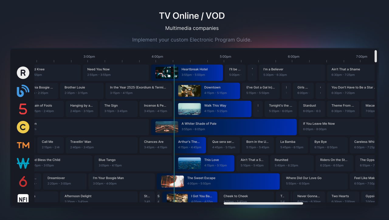
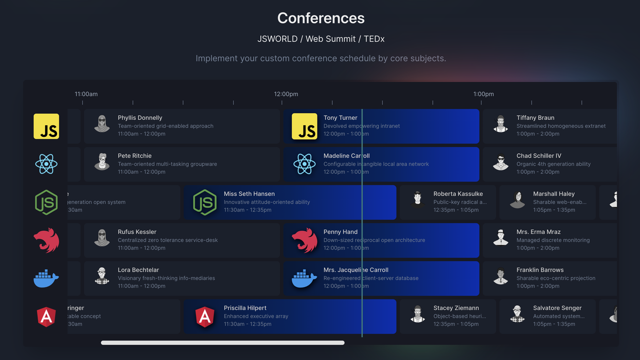
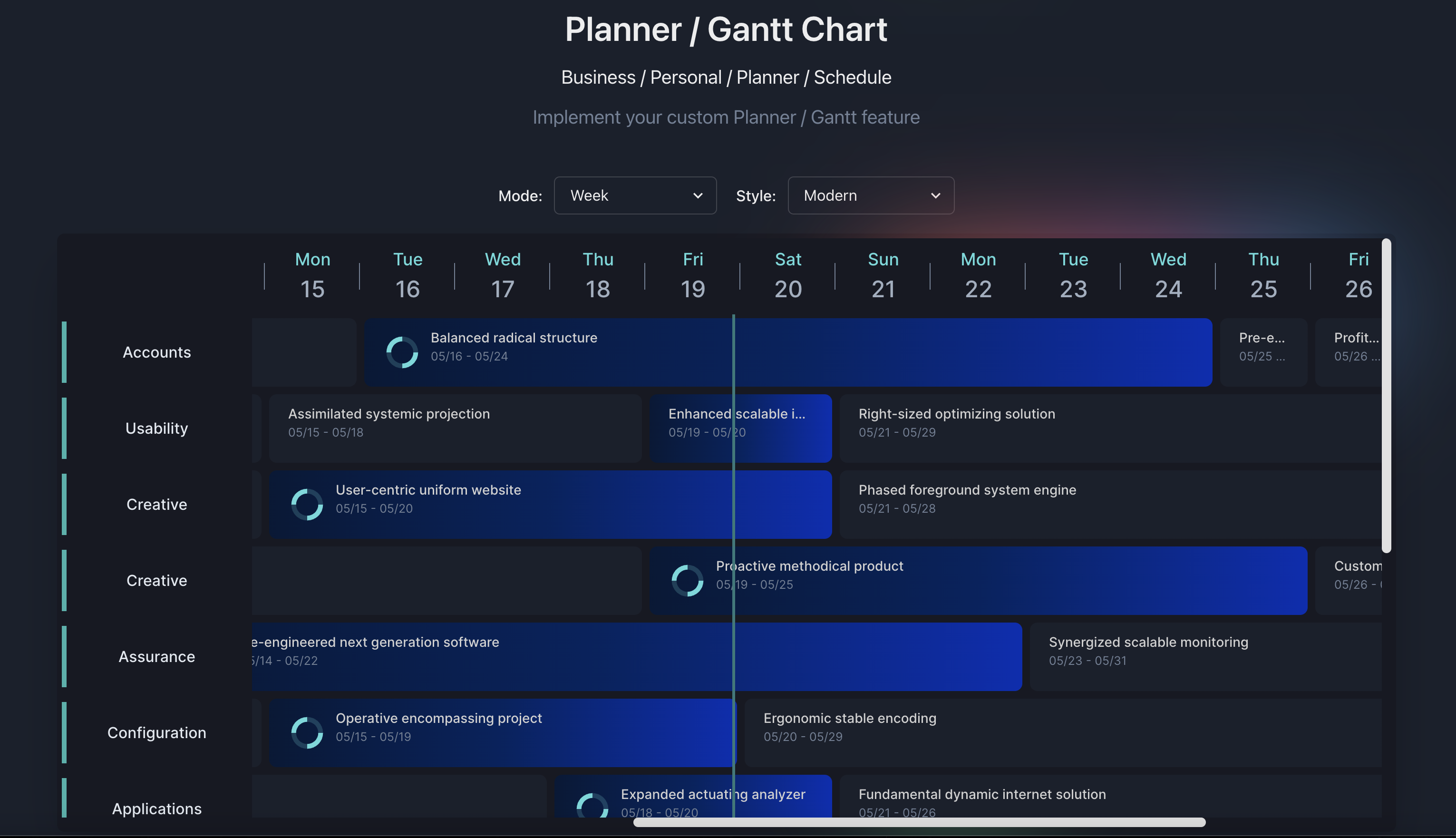


Planby is coming to React Native, and the beta is open for free testing. It is a separate package from this one; the web component documented here is unaffected.
👉 Sign up for the Planby Native beta
Live example - Typescript Codesandbox
Live example - website with control panel

Become a sponsor, support, and help us in continuing our development. -> Opencollective
- yarn
yarn add planby- npm
npm install planbyAI assistants know React, but they don't know Planby. Left to guess, they invent
useEpg options that don't exist, forget that channels and epg have to be
memoized, and reach for features that are only in Planby PRO.
Planby ships an agent skill — a compact description of the API, verified against the source — that your assistant reads before it writes any code.
npm install planby
npx planby init-ai
One command wires the skill into every agent you use:
| Agent | What it writes |
|---|---|
| Claude Code / Agent SDK | .claude/skills/planby |
| Cursor | .cursor/rules/planby.mdc |
| Windsurf | .windsurf/rules/planby.md |
| Codex, Gemini CLI, Antigravity, … | a section in AGENTS.md |
Each file is a thin pointer to the skill bundled inside node_modules/planby, so
the guidance always matches the version you actually installed. Re-run it after
upgrading — it is safe to run repeatedly.
Using ChatGPT or another tool without a rules file? Paste
node_modules/planby/skills/planby/SKILL.md into the conversation.
"Build me a conference schedule with five stages from 9:00 to 17:00."
import React from 'react';
import { useEpg, Epg, Layout } from 'planby';

const channels = [
  { uuid: 'stage-a', logo: '/stage-a.png' },
  { uuid: 'stage-b', logo: '/stage-b.png' },
  { uuid: 'stage-c', logo: '/stage-c.png' },
  { uuid: 'stage-d', logo: '/stage-d.png' },
  { uuid: 'stage-e', logo: '/stage-e.png' },
];

const epg = [
  {
    id: 'p-1',
    channelUuid: 'stage-a', // must match a channels[].uuid
    title: 'Opening Keynote',
    description: 'Welcome & vision', // required by the Program type
    image: '/keynote.png',
    since: '2022-02-02T09:00:00',
    till: '2022-02-02T10:00:00',
  },
  {
    id: 'p-2',
    channelUuid: 'stage-b',
    title: 'Workshop: Data',
    description: 'Hands-on session',
    image: '/workshop.png',
    since: '2022-02-02T10:30:00',
    till: '2022-02-02T12:00:00',
  },
  {
    id: 'p-3',
    channelUuid: 'stage-e',
    title: 'Closing Panel',
    description: 'Q&A with the speakers',
    image: '/panel.png',
    since: '2022-02-02T16:00:00',
    till: '2022-02-02T17:00:00',
  },
];

export function Schedule() {
  const channelsData = React.useMemo(() => channels, []);
  const epgData = React.useMemo(() => epg, []);

  const { getEpgProps, getLayoutProps } = useEpg({
    channels: channelsData,
    epg: epgData,
    startDate: '2022-02-02T09:00:00',
    endDate: '2022-02-02T17:00:00',
    dayWidth: 2400, // 8h range × 300px per hour
  });

  return (
    <div style={{ height: '600px', width: '1200px' }}>
      <Epg {...getEpgProps()}>
        <Layout {...getLayoutProps()} />
      </Epg>
    </div>
  );
}"Now restyle it to match our light theme, add shadows, and show each session’s duration."
The assistant layers customization on top without rebuilding the data wiring — a
full theme, and globalStyles for the font and the shadow around the whole
guide, plus a custom renderProgram built on the useProgram hook:
// `.planby` is the container of the whole schedule — that is where a shadow
// around the guide belongs. It is the one class hook the library exposes.
const globalStyles = `
  @import url("https://fonts.googleapis.com/css2?family=Inter:wght@400;500;600&display=swap");

  .planby {
    font-family: "Inter", system-ui, sans-serif;
    border-radius: 12px;
    box-shadow: 0 10px 30px rgb(15 23 42 / 15%);
    overflow: hidden;
  }
`;

const formatDuration = (since, till) => {
  const minutes = Math.round((new Date(till) - new Date(since)) / 60000);
  const h = Math.floor(minutes / 60);
  const m = minutes % 60;
  return h ? (m ? `${h}h ${m}m` : `${h}h`) : `${m}m`;
};

const Program = ({ program, ...rest }) => {
  const { styles, formatTime, isLive } = useProgram({ program, ...rest });
  const { title, since, till } = program.data;

  return (
    <ProgramBox width={styles.width} style={styles.position}>
      <ProgramContent width={styles.width} isLive={isLive}>
        <ProgramStack>
          <ProgramTitle>{title}</ProgramTitle>
          <ProgramText>
            {formatTime(since)} - {formatTime(till)} ·{' '}
            {formatDuration(since, till)}
          </ProgramText>
        </ProgramStack>
      </ProgramContent>
    </ProgramBox>
  );
};

// globalStyles goes on useEpg, alongside your theme:
useEpg({ channels, epg, startDate, endDate, theme, globalStyles });

<Layout
  {...getLayoutProps()}
  renderProgram={({ program, ...rest }) => (
    <Program key={program.data.id} program={program} {...rest} />
  )}
/>;
Both prompts above, run end to end — five stages across a 9:00–17:00 range, re-skinned to a light theme with a shadow around the guide and a duration on every session card.
- "Switch the guide to 12-hour time and right-to-left."
- "Make the program cards match this Figma — rounded corners, our brand hover."
- "Load the programs from our API and show the spinner while it fetches."
- "Why is my guide zoomed in so far?" — a classic:
dayWidthis spread across the wholestartDate…endDaterange, not per day. - "Nothing renders." — usually an un-memoized array, a
channelUuidthat matches no channel, or a container with no explicit height.
| Topic | Reference |
|---|---|
| Starter, sizing, async data | references/quick-start.md |
| Channel & Program schemas | references/data-schemas.md |
Every useEpg option and return value |
references/useEpg-api.md |
| Theme — and what each color controls | references/theme.md |
| Custom program / channel / timeline rendering | references/render-functions.md |
Branding, fonts, styled() overrides |
references/customization.md |
Two runnable, type-checked examples ship alongside them in
skills/planby/examples/.
The skill knows which features belong to Planby PRO and will tell you instead of generating code that cannot work: vertical / single-track mode, drag-and-drop, resizing, week and month calendar views, timezone conversion, grid cells, highlighted areas, mobile controllers, and scroll-based lazy loading.
import { useEpg, Epg, Layout } from 'planby';

const channels = React.useMemo(
  () => [
    {
      logo: 'https://via.placeholder.com',
      uuid: '10339a4b-7c48-40ab-abad-f3bcaf95d9fa',
      ...
    },
  ],
  []
);

const epg = React.useMemo(
  () => [
    {
      channelUuid: '30f5ff1c-1346-480a-8047-a999dd908c1e',
      description:
        'Ut anim nisi consequat minim deserunt...',
      id: 'b67ccaa3-3dd2-4121-8256-33dbddc7f0e6',
      image: 'https://via.placeholder.com',
      since: "2022-02-02T23:50:00",
      till: "2022-02-02T00:55:00",
      title: 'Title',
      ...
    },
  ],
  []
);

const {
  getEpgProps,
  getLayoutProps,
  onScrollToNow,
  onScrollLeft,
  onScrollRight,
} = useEpg({
  epg,
  channels,
  startDate: '2022-02-02T00:00:00'
});

return (
  <div>
    <div style={{ height: '600px', width: '1200px' }}>
      <Epg {...getEpgProps()}>
        <Layout
          {...getLayoutProps()}
        />
      </Epg>
    </div>
  </div>
);
or
const {
  getEpgProps,
  getLayoutProps,
  ...
} = useEpg({
  epg,
  channels,
 startDate: '2022/02/02', // or 2022-02-02T00:00:00
  width: 1200,
  height: 600
});

return (
  <div>
     <Epg {...getEpgProps()}>
        <Layout
          {...getLayoutProps()}
        />
      </Epg>
  </div>
or
const {
  getEpgProps,
  getLayoutProps,
  ...
} = useEpg({
  epg,
  channels,
  startDate: '2022-02-02T10:00:00',
  endDate: '2022-02-02T20:00:00',
  width: 1200,
  height: 600
});

return (
  <div>
     <Epg {...getEpgProps()}>
        <Layout
          {...getLayoutProps()}
        />
      </Epg>
</div>Available options in useEpg
| Property | Type | Status | Description | Access |
|---|---|---|---|---|
channels |
array |
required | Array with channels data | |
epg |
array |
required | Array with EPG data | |
width |
number |
optional | EPG width | |
height |
number |
optional | EPG height | |
sidebarWidth |
number |
optional | Width of the sidebar with channels | |
timelineHeight |
number |
optional | Height of the timeline | PRO |
itemHeight |
number |
optional | Height of channels and programs in the EPG. Default value is 80 | |
dayWidth |
number |
optional | Width of the day. Default value is 7200. Calculation to set up day width with own hour width value e.g., 24h * 300px (your custom hour width) = 7200px -> dayWidth |
|
startDate |
string |
optional | Date format 2022/02/02 or 2022-02-02T00:00:00. You can set your own start time, e.g., 2022-02-02T10:00:00, 2022-02-02T14:00:00, etc. Full clock hours only |
|
endDate |
string |
optional | Date format 2022-02-02T00:00:00, 2022-02-02T20:00:00, etc. Must be within the same 24-hour period as startDate. Full clock hours only. Scroll through multiple days and timeline mode is available only in PRO plan. |
PRO |
hoursInDays |
array |
optional | Set start time and end time of each day in multiple days feature if your data for each day has some time spaces between items in the day. |
PRO |
initialScrollPositions |
object |
optional | Set initial scroll position in Layout, e.g., initialScrollPositions: { top: 500, left: 800 } |
PRO |
liveRefreshTime |
number |
optional | Live refresh time of the events. Default value is 120 sec. | PRO |
isBaseTimeFormat |
boolean |
optional | Convert to 12-hour format, e.g., 2:00am, 4:00pm, etc. Default value is false. |
|
isCurrentTime |
boolean |
optional | Show current time in Timeline. Default value is false. | PRO |
isInitialScrollToNow |
boolean |
optional | Scroll to the current live element. | PRO |
isVerticalMode |
boolean |
optional | Show Timeline in vertical view. Default value is false. | PRO |
isResize |
boolean |
optional | Possibility to resize the element. | PRO |
isSidebar |
boolean |
optional | Show/hide sidebar | |
isTimeline |
boolean |
optional | Show/hide timeline | |
isLine |
boolean |
optional | Show/hide line | |
isRTL |
boolean |
optional | Change direction to RTL or LTR. Default value is false. | PRO |
theme |
object |
optional | Object with theme schema | |
timezone |
object |
optional | Convert and display data from UTC format to your own time zone | PRO |
areas |
array |
optional | Area gives possibilities to add field ranges to the Timeline layout. | PRO |
mode |
object |
optional | Type values: day/week/month. Style values: default/modern Define the mode and style of the timeline. Default mode is day and style is default |
PRO |
overlap |
object |
optional | Enable the element overlaps in the layout. Mode values: stack/layer, layerOverlapLevel: number |
PRO |
drag and drop |
object |
optional | Drag and move the element in the layout. Mode values: row/multi-rows |
PRO |
grid layout |
object |
optional | Background grid on the layout. Mode hoverHighlight values: true/false, onGridItemClick: function with all the properties on clicked item grid |
PRO |
channelMapKey |
string |
optional | The Channel uuid attribute can be controlled by prop. Key map gives a possibilities to use specific prop from own data instead of needing to map to uuid in own data |
PRO |
programChannelMapKey |
string |
optional | The Programs channelUuid attributes can be controlled by prop. Key map gives a possibilities to use a specific prop from own data instead of needing to map to channelUuid in your data |
PRO |
globalStyles |
string |
optional | Inject custom global styles and font. Font weight: 400,500,600. Default font is "Inter" | PRO |
Without declaring the width and length properties, the component takes the dimensions of the parent element.
Inject own custom font and other global styles.
const globalStyles = `
  @import url("https://fonts.googleapis.com/css2?family=Inter:wght@400;500;600&display=swap");

/* Available in PRO plan */
 .planby {
  font-family: "Inter", system-ui, -apple-system, "Segoe UI", Roboto, Helvetica,
    Arial, sans-serif, "Apple Color Emoji", "Segoe UI Emoji";

  /* Layout */
  .planby-layout {}

  /* Line */
  .planby-line {}

  /* Current time */
  .planby-current-time {}
  .planby-current-content {}

  /* Channels */
  .planby-channels {}

  /* Channel */
  .planby-channel {}

  /* Program */
  .planby-program {}
  .planby-program-content {}
  .planby-program-flex {}
  .planby-program-stack {}
  .planby-program-title {}
  .planby-program-text {}

  /* Timeline */
  .planby-timeline-wrapper {}
  .planby-timeline-box {}
  .planby-timeline-time {}
  .planby-timeline-dividers {}
  .planby-timeline-wrapper {}
}

`;Properties returned from useEpg
| Property | Type | Description |
|---|---|---|
scrollY |
number |
Current scroll y value |
scrollX |
number |
Current scroll x value |
onScrollLeft |
function(value: number) |
Default value is 300 |
onScrollRight |
function(value: number) |
Default value is 300 |
onScrollToNow |
function() |
Scroll to current time/live programs |
onScrollTop |
function(value: number) |
Default value is 300 |
| Property | Type | Status |
|---|---|---|
logo |
string |
required |
uuid |
string |
required |
| Property | Type | Status | Description | Access |
|---|---|---|---|---|
channelUuid |
string |
required | ||
id |
string |
required | ||
image |
string |
required | ||
since |
string |
required | ||
till |
string |
required | ||
title |
string |
required | ||
fixedVisibility |
boolean |
optional | The element is always visible in the layout during the scroll events | Sponsors |
Available props in Epg
| Property | Type | Description | Status |
|---|---|---|---|
isLoading |
boolean |
Loader state | optional |
loader |
Component |
Loader custom component | optional |
Available props in Layout.
| Property | Type | Description | Status | Access |
|---|---|---|---|---|
renderProgram |
function({ program: { data: object, position: object}) |
data object contains all properties related to the program, position object includes all position styles |
optional | |
renderChannel |
function({ channel: { ..., position: object}) |
channel object contains all properties related to the channel, position object includes all position styles |
optional | |
renderTimeline |
function({sidebarWidth: number}) |
sidebarWidth value of the channel's sidebar width |
optional | |
renderLine |
function({styles: object}) |
basic styles and position values for the custom live tracking Line |
optional | Sponsors |
renderCurrentTime |
function({styles: object, isRTL: boolean, isBaseTimeFormat: boolean, time: string}) |
basic styles values for the custom current time |
optional | Sponsors |
You can use Plaby's style components to develop main features. Moreover, you can integrate with third party UI library eg. Chakra UI, Material UI etc or make custom styles.
Below is an example that allows you to render your custom Program component using Plaby's style components.
import {
  useEpg,
  Epg,
  Layout,
  ProgramBox,
  ProgramContent,
  ProgramFlex,
  ProgramStack,
  ProgramTitle,
  ProgramText,
  ProgramImage,
  useProgram,
  Program,
  ProgramItem
} from "planby";


const Item = ({ program,...rest }: ProgramItem) => {
  const { styles, formatTime, isLive, isMinWidth } = useProgram({ program,...rest });

  const { data } = program;
  const { image, title, since, till } = data;

  const sinceTime = formatTime(since);
  const tillTime = formatTime(till);

  return (
    <ProgramBox width={styles.width} style={styles.position}>
      <ProgramContent
        width={styles.width}
        isLive={isLive}
      >
        <ProgramFlex>
          {isLive && isMinWidth && <ProgramImage src={image} alt="Preview" />}
          <ProgramStack>
            <ProgramTitle>{title}</ProgramTitle>
            <ProgramText>
              {sinceTime} - {tillTime}
            </ProgramText>
          </ProgramStack>
        </ProgramFlex>
      </ProgramContent>
    </ProgramBox>
  );
};

function App() {

  ...

 const {
  getEpgProps,
  getLayoutProps,
} = useEpg({
  epg,
  channels,
  startDate: '2022/02/02', // or 2022-02-02T00:00:00
});

return (
  <div>
    <div style={{ height: '600px', width: '1200px' }}>
      <Epg {...getEpgProps()}>
        <Layout
            {...getLayoutProps()}
            renderProgram={({ program,...rest }) => (
              <Item key={program.data.id} program={program} {...rest} />
            )}
          />
      </Epg>
    </div>
  </div>
);
}

export default App;Below is an example that allows you to render your custom Program component with 12 hours time format using Plaby's style components.
...
const Item = ({ program, ...rest }: ProgramItem) => {
  const {
    styles,
    formatTime,
    set12HoursTimeFormat,
    isLive,
    isMinWidth,
  } = useProgram({
    program,
    ...rest
  });

  const { data } = program;
  const { image, title, since, till } = data;

  const sinceTime = formatTime(since, set12HoursTimeFormat()).toLowerCase();
  const tillTime = formatTime(till, set12HoursTimeFormat()).toLowerCase();

  return (
    <ProgramBox width={styles.width} style={styles.position}>
      <ProgramContent
        width={styles.width}
        isLive={isLive}
      >
        <ProgramFlex>
          {isLive && isMinWidth && <ProgramImage src={image} alt="Preview" />}
          <ProgramStack>
            <ProgramTitle>{title}</ProgramTitle>
            <ProgramText>
              {sinceTime} - {tillTime}
            </ProgramText>
          </ProgramStack>
        </ProgramFlex>
      </ProgramContent>
    </ProgramBox>
  );
};

function App() {

  ...

 const {
  getEpgProps,
  getLayoutProps,
} = useEpg({
  epg,
  channels,
  isBaseTimeFormat: true,
  startDate: '2022/02/02', // or 2022-02-02T00:00:00
});

...
}

export default App;Below is an example that allows you to render your custom Program component with RTL direction using Plaby's style components.
...
const Item = ({ program, ...rest }: ProgramItem) => {
  const {
    isRTL,
    isLive,
    isMinWidth,
    formatTime,
    styles,
    set12HoursTimeFormat,
    getRTLSinceTime,
    getRTLTillTime,
  } = useProgram({
    program,
    ...rest
  });

  const { data } = program;
  const { image, title, since, till } = data;

  const sinceTime = formatTime(
    getRTLSinceTime(since),
    set12HoursTimeFormat()
  ).toLowerCase();
  const tillTime = formatTime(
    getRTLTillTime(till),
    set12HoursTimeFormat()
  ).toLowerCase();

  return (
    <ProgramBox width={styles.width} style={styles.position}>
      <ProgramContent width={styles.width} isLive={isLive}>
        <ProgramFlex>
          {isLive && isMinWidth && <ProgramImage src={image} alt="Preview" />}
          <ProgramStack isRTL={isRTL}>
            <ProgramTitle>{title}</ProgramTitle>
            <ProgramText>
              {sinceTime} - {tillTime}
            </ProgramText>
          </ProgramStack>
        </ProgramFlex>
      </ProgramContent>
    </ProgramBox>
  );
};

function App() {

  ...

 const {
  getEpgProps,
  getLayoutProps,
} = useEpg({
  epg,
  channels,
  isBaseTimeFormat: true,
  startDate: '2022/02/02', // or 2022-02-02T00:00:00
});

...
}

export default App;Below is an example that allows you to render your custom Channel component using Plaby's style components.
import { useEpg, Epg, Layout, ChannelBox, ChannelLogo, Channel } from 'planby';

interface ChannelItemProps {
  channel: Channel;
}

const ChannelItem = ({ channel }: ChannelItemProps) => {
  const { position, logo } = channel;
  return (
    <ChannelBox {...position}>
      <ChannelLogo
        onClick={() => console.log('channel', channel)}
        src={logo}
        alt="Logo"
      />
    </ChannelBox>
  );
};


function App() {

  ...

  const {
    getEpgProps,
    getLayoutProps,
  } = useEpg({
    epg,
    channels,
    startDate: '2022/02/02', // or 2022-02-02T00:00:00
  });

  return (
    <div>
      <div style={{ height: '600px', width: '1200px' }}>
        <Epg {...getEpgProps()}>
          <Layout
              {...getLayoutProps()}
              renderChannel={({ channel }) => (
              <ChannelItem key={channel.uuid} channel={channel} />
            )}
            />
        </Epg>
      </div>
    </div>
  );
}Below is an example that allows you to render your custom Timeline component using Plaby's style components.
import {
  TimelineWrapper,
  TimelineBox,
  TimelineTime,
  TimelineDivider,
  TimelineDividers,
  useTimeline,
} from 'planby';

interface TimelineProps {
  isBaseTimeFormat: boolean;
  isSidebar: boolean;
  dayWidth: number;
  hourWidth: number;
  numberOfHoursInDay: number;
  offsetStartHoursRange: number;
  sidebarWidth: number;
}

export function Timeline({
  isBaseTimeFormat,
  isSidebar,
  dayWidth,
  hourWidth,
  numberOfHoursInDay,
  offsetStartHoursRange,
  sidebarWidth,
}: TimelineProps) {
  const { time, dividers, formatTime } = useTimeline(
    numberOfHoursInDay,
    isBaseTimeFormat
  );

  const renderTime = (index: number) => (
    <TimelineBox key={index} width={hourWidth}>
      <TimelineTime>
        {formatTime(index + offsetStartHoursRange).toLowerCase()}
      </TimelineTime>
      <TimelineDividers>{renderDividers()}</TimelineDividers>
    </TimelineBox>
  );

  const renderDividers = () =>
    dividers.map((_, index) => (
      <TimelineDivider key={index} width={hourWidth} />
    ));

  return (
    <TimelineWrapper
      dayWidth={dayWidth}
      sidebarWidth={sidebarWidth}
      isSidebar={isSidebar}
    >
      {time.map((_, index) => renderTime(index))}
    </TimelineWrapper>
  );
}

function App() {

  ...

  const {
    getEpgProps,
    getLayoutProps,
  } = useEpg({
    epg,
    channels,
    startDate: '2022/02/02', // or 2022-02-02T00:00:00
  });

  return (
    <div>
      <div style={{ height: '600px', width: '1200px' }}>
        <Epg {...getEpgProps()}>
          <Layout
              {...getLayoutProps()}
              renderTimeline={(props) => <Timeline {...props} />}
            />
        </Epg>
      </div>
    </div>
  );
}

export default App;Below is an example that allows you to render your custom Timeline component using Plaby's style components.
import {
  TimelineWrapper,
  TimelineBox,
  TimelineTime,
  TimelineDivider,
  TimelineDividers,
  useTimeline,
} from 'planby';

interface TimelineProps {
  isRTL: boolean;
  isBaseTimeFormat: boolean;
  isSidebar: boolean;
  dayWidth: number;
  hourWidth: number;
  numberOfHoursInDay: number;
  offsetStartHoursRange: number;
  sidebarWidth: number;
}

export function Timeline({
  isRTL,
  isBaseTimeFormat,
  isSidebar,
  dayWidth,
  hourWidth,
  numberOfHoursInDay,
  offsetStartHoursRange,
  sidebarWidth,
}: TimelineProps) {
  const { time, dividers, formatTime } = useTimeline(
    numberOfHoursInDay,
    isBaseTimeFormat
  );

  const renderTime = (index: number) => (
    <TimelineBox key={index} width={hourWidth}>
      <TimelineTime isBaseTimeFormat={isBaseTimeFormat} isRTL={isRTL}>
        {formatTime(index + offsetStartHoursRange).toLowerCase()}
      </TimelineTime>
      <TimelineDividers>{renderDividers()}</TimelineDividers>
    </TimelineBox>
  );

 ...
}Make your theme custom. Below is theme schema that you can pass as one of the options to useEpg hook.
const theme = {
  primary: {
    600: '#1a202c',
    900: '#171923',
  },
  grey: { 300: '#d1d1d1' },
  white: '#fff',
  green: {
    300: '#2C7A7B',
  },
  loader: {
    teal: '#5DDADB',
    purple: '#3437A2',
    pink: '#F78EB6',
    bg: '#171923db',
  },
  scrollbar: {
    border: '#ffffff',
    thumb: {
      bg: '#e1e1e1',
    },
  },
  gradient: {
    blue: {
      300: '#002eb3',
      600: '#002360',
      900: '#051937',
    },
  },
  text: {
    grey: {
      300: '#a0aec0',
      500: '#718096',
    },
  },
  timeline: {
    divider: {
      bg: '#718096',
    },
  },
};import {
Epg,
Layout,
ChannelBox,
ChannelLogo,
ProgramBox,
ProgramContent,
ProgramFlex,
ProgramStack,
ProgramTitle,
ProgramText,
ProgramImage,
TimelineWrapper,
TimelineBox,
TimelineTime,
TimelineDividers,
useEpg,
useProgram,
useTimeline,
Program, // Interface
Channel, // Interface
ProgramItem, // Interface for program render
Theme, // Interface
} from 'planby';Custom License - All Rights Reserved. See LICENSE for more information.
Karol Kozer - @kozerkarol_twitter
Project Link: https://github.com/karolkozer/planby